Pulled a late night at the studio preparing for tomorrow's logo presentation.
Identity designing is probably our number one design love.
There's just something about creating a perfect visual identity for both start up businesses and established businesses that are looking to rebrand or invest in branding for the first time!
Here's a few samples of some of the logos we have designed. Not only do we have a thorough design process, everything we create is original and designed with your business needs in mind. We take pride in designing "on purpose" unlike the thoughtless clip art logo designs that seem so prevalent in today's markets.
If you're interested in branding your business, give us a call! We'd love to talk to you about how a strong brand image and visual identity can grow your business!
530.790.5762
Showing posts with label yuba city logo designer. Show all posts
Thursday, March 22, 2012
Monday, November 7, 2011
sunflower natural foods market-advertisments
A couple months ago, Yuba City's oldest and most loved health food store, Sunflower Natural Foods Market, contacted us about vectorizing a new logo concept by Dr. Afato (Sunflower is owned by the Afato Family).
After cleaning up and vectorizing the two designs, we took the initial concept of Dr. Afato and simplified it further. The end result ended up being the chosen concept, and with minor edits, is now the new face of Sunflower Natural Food Markets!
Needles to say, we were thrilled when they came back and asked us to design some advertisements for some free community events they offer.
We created text boxes playing off the organic feel of the letterforms Billy created for the new logo and found a way to cleanly present all the needed information.
These two ads will soon be published in our local newspaper. We also designed handbills and posters to further promote these awesome, free events! Thanks for thinking Different By Design, Sunflower!
After cleaning up and vectorizing the two designs, we took the initial concept of Dr. Afato and simplified it further. The end result ended up being the chosen concept, and with minor edits, is now the new face of Sunflower Natural Food Markets!
Needles to say, we were thrilled when they came back and asked us to design some advertisements for some free community events they offer.
We created text boxes playing off the organic feel of the letterforms Billy created for the new logo and found a way to cleanly present all the needed information.
These two ads will soon be published in our local newspaper. We also designed handbills and posters to further promote these awesome, free events! Thanks for thinking Different By Design, Sunflower!
Thursday, July 21, 2011
value of good design...
"Questions about whether design is necessary or affordable are quite beside the point: design is inevitable. The alternative to good design is bad design, not no design at all." - douglas martin
It seems like the value of good design has been a daily topic in our studio since, well, always!
At Different By Design we adhere to the highest design standards in everything we create. This tends to cause some confusion at times when we are innocently asked if we can just "throw something together" or told they just need something "cheap" to get them by.
While we understand that businesses have budgets, being asked questions like the ones above at the start of a client meeting is always a huge red flag for us.
Design isn't something that we can "dumb down" or "whip out" for a cheaper price. We understand the value of good design in the business world and we would never jeopardize our client's reputation or our own by creating thoughtless work. Though we are obviously open to discussing client budgets, with design the old adage rings true...you get what you pay for!
I snapped the above picture of Billy in the studio earlier. He was showing me a sketch he had just completed for a redesign of a brochure we are doing for the City.
It makes me proud to work with someone with an equally high work ethic, who puts detail and thought into everything he does. I think it's clear in our work that when you hire Different By Design you are getting the absolute best solution to your design problem.
It seems like the value of good design has been a daily topic in our studio since, well, always!
At Different By Design we adhere to the highest design standards in everything we create. This tends to cause some confusion at times when we are innocently asked if we can just "throw something together" or told they just need something "cheap" to get them by.
While we understand that businesses have budgets, being asked questions like the ones above at the start of a client meeting is always a huge red flag for us.
Design isn't something that we can "dumb down" or "whip out" for a cheaper price. We understand the value of good design in the business world and we would never jeopardize our client's reputation or our own by creating thoughtless work. Though we are obviously open to discussing client budgets, with design the old adage rings true...you get what you pay for!
I snapped the above picture of Billy in the studio earlier. He was showing me a sketch he had just completed for a redesign of a brochure we are doing for the City.
It makes me proud to work with someone with an equally high work ethic, who puts detail and thought into everything he does. I think it's clear in our work that when you hire Different By Design you are getting the absolute best solution to your design problem.
Wednesday, July 13, 2011
Inner Visions Consulting & Management Group, LLC
Because who doesn't love a good "before and after"?
When Larry Johns was in the process of developing a web site for his consulting business for nonprofit organizations, Inner Visions Consulting & Management Group, LLC, he had his web site designer throw together a logo for him based off of some of Larry's personal preferences. Here is the logo he was provided (see below) and before using it Larry decided to ask several people their opinion on it, one of them being his daughter Lindsay Warren.
Thankfully Lindsay honestly told him that she didn't think this logo worked well. She knew that a logo should be clean and simple and recommended that her father give us a call (thanks Lindsay!).
After hearing about us from Lindsay, Larry asked Karon Pate, an employee and client of ours through Randy Meyer Investment Management, LLC about her experiences with us. I must say it makes us feel extremely proud and humbled all at the same time when a client gives us a rave review (thanks Karon!).
With these two referrals in hand, Larry contacted us and after a wonderful meeting getting to know Larry and his goals for Inner Visions, we were off designing a new logo for him that would reflect his professionalism, strong ethics, and innovative attitude.
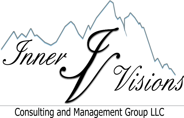
Below is the end result-final logo from our collaboration with Larry. One of the main characteristics of a great logo design is timelessness. Paul Rand, perhaps the most iconic identity designer to ever live, said, "One quickly realizes that simplicity and geometry are the language of timelessness and universality."
With over 25 years experience in business development and management and over 30 years of involvement with many high profile wildlife organizations, Larry brings an unbeatable inside knowledge and expertise with him to Inner Visions Consulting & Management Group, LLC.
While Larry and his team are more than qualified to consult any nonprofit group, their focus is on outdoors, conservation, and hunting organizations.
We decided to play off of the outdoor elements by using the Gestalt Theory to create mountains that also resemble a graph. We had the last "mountain" peak bleed off the logo to represent that Larry and his team can lead your organization and/or revenues as high as you will let them take you.
The mountains can also serve to represent the "mountain of problems" or burden that nonprofit organizations can feel when left to orchestrate everything without the proper knowledge of a strategic plan. That's where Inner Visions Consulting & Management Group, LLC can step in and execute a plan for you and work with you step by step to eliminate unneeded stress so your organization can focus on their mission and growing their sponsors and group awareness.
We decided on 4 mountain peaks because Inner Visions' initials (IV) make the roman numeral for the number 4 which reminded us of the 4 elements and the 4 corners of the Earth which relate back to the focus of Larry's clientele being that they are mainly outdoors, conservation, and hunting organizations.
We chose a clean font that is also condensed because of the length of the business name and we liked how the ampersand played off of the overall look of the design. Calming earth tones were selected for the logo to keep in line with the nature of his work.
Larry, thank you so much for your time and your trust. We look forward to watching the growth of Inner Visions Consulting & Management, LLC and building a long lasting relationship with you! Once again, the pleasure was all ours! Thank you!
When Larry Johns was in the process of developing a web site for his consulting business for nonprofit organizations, Inner Visions Consulting & Management Group, LLC, he had his web site designer throw together a logo for him based off of some of Larry's personal preferences. Here is the logo he was provided (see below) and before using it Larry decided to ask several people their opinion on it, one of them being his daughter Lindsay Warren.
Thankfully Lindsay honestly told him that she didn't think this logo worked well. She knew that a logo should be clean and simple and recommended that her father give us a call (thanks Lindsay!).
After hearing about us from Lindsay, Larry asked Karon Pate, an employee and client of ours through Randy Meyer Investment Management, LLC about her experiences with us. I must say it makes us feel extremely proud and humbled all at the same time when a client gives us a rave review (thanks Karon!).
With these two referrals in hand, Larry contacted us and after a wonderful meeting getting to know Larry and his goals for Inner Visions, we were off designing a new logo for him that would reflect his professionalism, strong ethics, and innovative attitude.
Below is the end result-final logo from our collaboration with Larry. One of the main characteristics of a great logo design is timelessness. Paul Rand, perhaps the most iconic identity designer to ever live, said, "One quickly realizes that simplicity and geometry are the language of timelessness and universality."
With over 25 years experience in business development and management and over 30 years of involvement with many high profile wildlife organizations, Larry brings an unbeatable inside knowledge and expertise with him to Inner Visions Consulting & Management Group, LLC.
While Larry and his team are more than qualified to consult any nonprofit group, their focus is on outdoors, conservation, and hunting organizations.
We decided to play off of the outdoor elements by using the Gestalt Theory to create mountains that also resemble a graph. We had the last "mountain" peak bleed off the logo to represent that Larry and his team can lead your organization and/or revenues as high as you will let them take you.
The mountains can also serve to represent the "mountain of problems" or burden that nonprofit organizations can feel when left to orchestrate everything without the proper knowledge of a strategic plan. That's where Inner Visions Consulting & Management Group, LLC can step in and execute a plan for you and work with you step by step to eliminate unneeded stress so your organization can focus on their mission and growing their sponsors and group awareness.
We decided on 4 mountain peaks because Inner Visions' initials (IV) make the roman numeral for the number 4 which reminded us of the 4 elements and the 4 corners of the Earth which relate back to the focus of Larry's clientele being that they are mainly outdoors, conservation, and hunting organizations.
We chose a clean font that is also condensed because of the length of the business name and we liked how the ampersand played off of the overall look of the design. Calming earth tones were selected for the logo to keep in line with the nature of his work.
Larry, thank you so much for your time and your trust. We look forward to watching the growth of Inner Visions Consulting & Management, LLC and building a long lasting relationship with you! Once again, the pleasure was all ours! Thank you!
Sunday, June 26, 2011
leave it to google
I was pleasantly surprised when I clicked onto Google last week, on June 21st (the fist day of summer!), to be specific and instantly recognized the art work of Japanese artist Takashi Murakami.
It reminded me of the Murakami Louis Vuitton pieces commissioned by Marc Jacobs a few seasons back.
Not exactly my personal taste (though I was obsessed with the panda he drew for Louis Vuitton), but you have to admit those cherry, bright colors make you smile! Very fitting to kick off one of our favorite seasons, Summer!
*top image taken from Google, bottom image is a result from a Google search
Wednesday, April 6, 2011
thank you
Just wanted to say thank you to everyone for the warm words and encouragement you've given us since we announced Billy will be leaving his management position at Sam's Club so that we can pursue our dream of opening a design studio this May!
We appreciate all of your positive energy and as always we love hearing from you!
As you can see the studio is coming along...Erik (owner of our building and of Square One Drafting & Design) sent us these pictures of our flooring and the paint progress! Thanks Erik!
We appreciate all of your positive energy and as always we love hearing from you!
As you can see the studio is coming along...Erik (owner of our building and of Square One Drafting & Design) sent us these pictures of our flooring and the paint progress! Thanks Erik!
Subscribe to:
Posts (Atom)